CSS Text Styling
In this tutorial, we will cover some of the important text styling properties:
Text Decoration
The text-decoration property adds various types of text decorations.
Syntax:
selector {
text-decoration: value;
}There are four values for text-decoration:
- overline: adds a line above the text
- underline: adds a line below the text
- line-through: adds a line through the text.
- none: to remove decoration.
Example:
<html lang="en">
<head>
<style>
#p1 {text-decoration: overline;}
#p2 {text-decoration: underline;}
#p3 {text-decoration: line-through;}
#p4 {text-decoration: overline underline;}
</style>
</head>
<body>
<p id="p1">text-decoration: overline</p>
<p id="p2">text-decoration: underline</p>
<p id="p3">text-decoration: line-through</p>
<p id="p4">text-decoration: overline underline</p>
</body>
</html>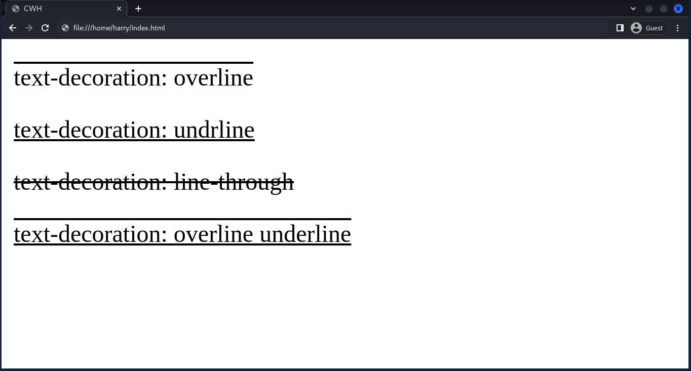
Text Alignment
The text-align property is used to align the text within the container. The container can be a div, section, etc.
Syntax:
selector {
text-align: value;
}There are four values for text-align:
- left: align the text to the left.
- center: align the text to the center.
- right: align the text to the right.
- justify: spread the text evenly between the left and right margins.
Example:
<html lang="en">
<head>
<style>
#p1 {text-align: left;}
#p2 {text-align: right;}
#p3 {text-align: end;}
#p4 {text-align: justify;}
</style>
</head>
<body>
<p id="p1">text-align: left</p>
<p id="p2">text-align: right</p>
<p id="p3">text-align: end</p>
<p id="p4">text-align: justify</p>
</body>
</html>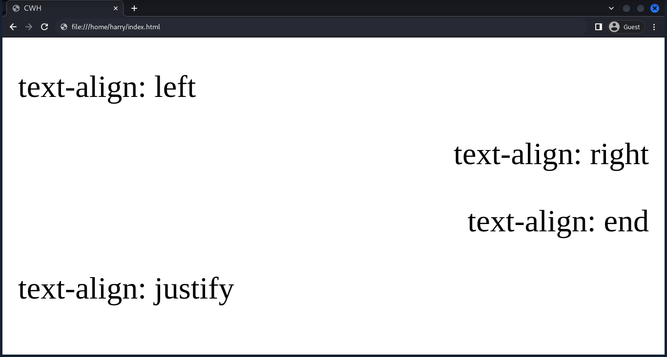
Text Transformation
It transforms the text case.
Syntax:
selector {
text-transform: value;
}There are four values for text-transform:
- uppercase: transform text to uppercase (all capital letters).
- lowercase: transform text to lowercase (all small letters).
- capitalize: capitalize the first character of each word.
- none: to remove text transformation.
Example:
<html lang="en">
<head>
<style>
#p1 {text-transform: uppercase;}
#p2 {text-transform: lowercase;}
#p3 {text-transform: capitalize;}
#p4 {text-transform: none;}
</style>
</head>
<body>
<p id="p1">text-transform: uppercase</p>
<p id="p2">text-transform: lowercase</p>
<p id="p3">text-transform: capitalize</p>
<p id="p4">text-transform: none</p>
</body>
</html>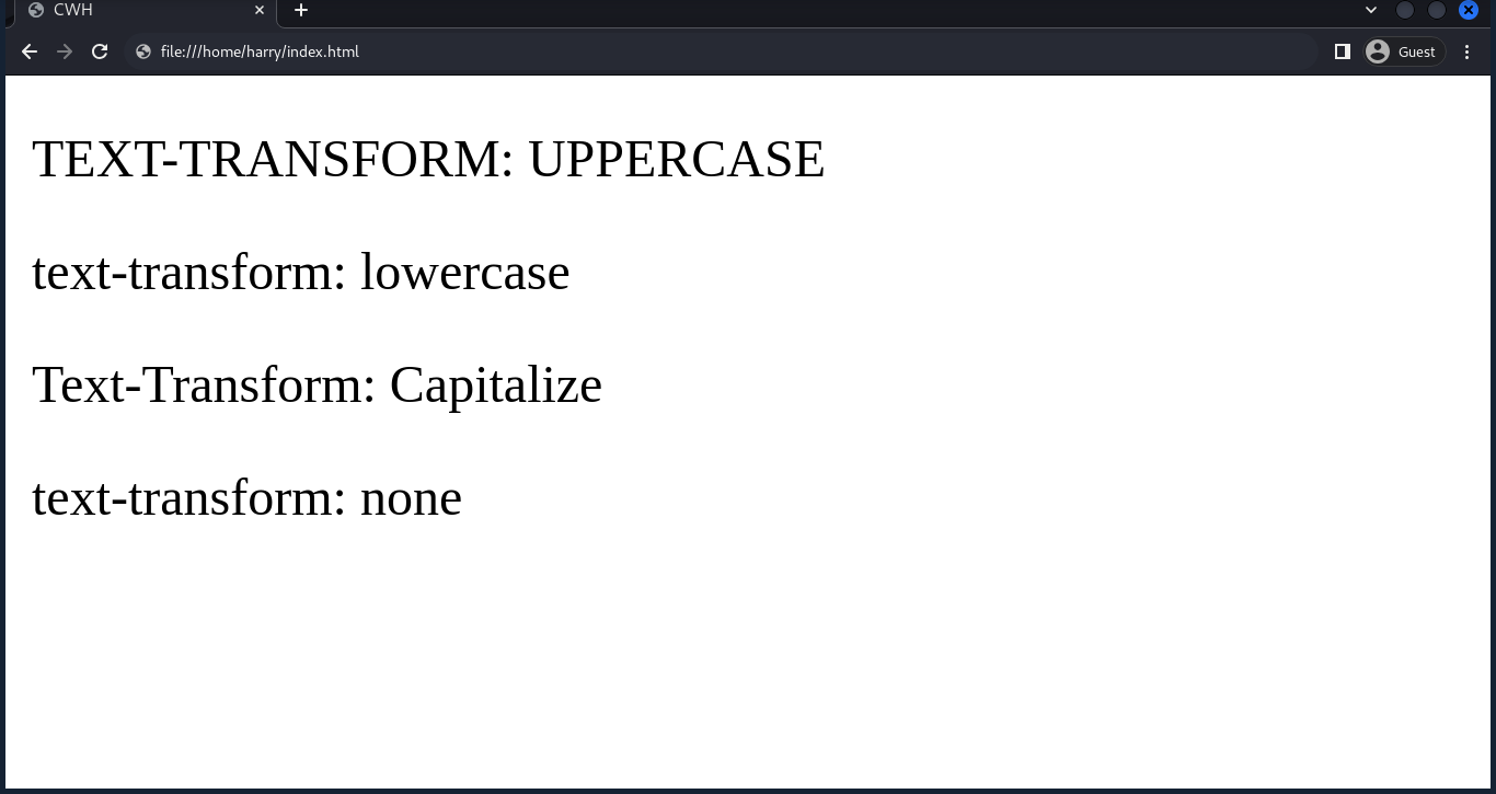
Letter Spacing
The letter-spacing property allows you to specify the spacing between each character in the text. The property values can be in pixels (px), em, rem, percentage (%), etc.
Example:
<html lang="en">
<head>
<style>
h1 {
letter-spacing: 5px;
}
</style>
</head>
<body>
<h1>CodeWithHarry</h1>
</body>
</html>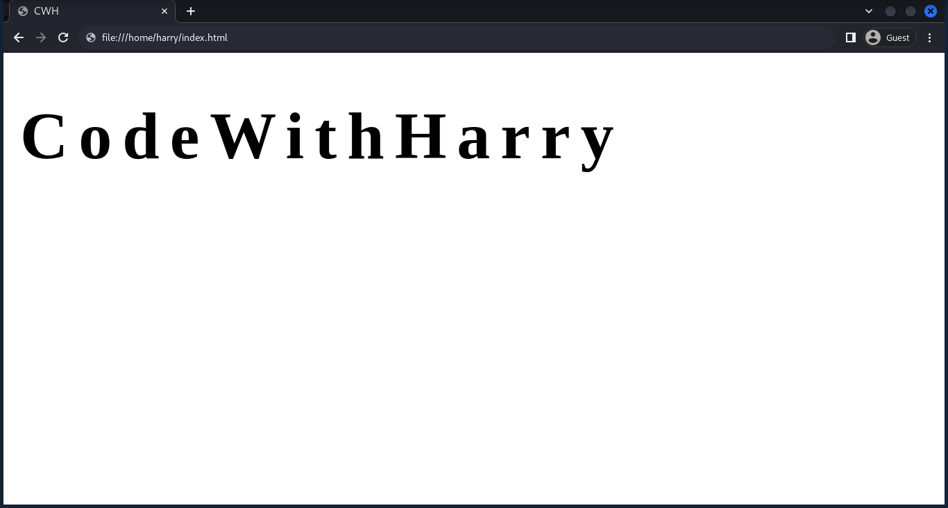
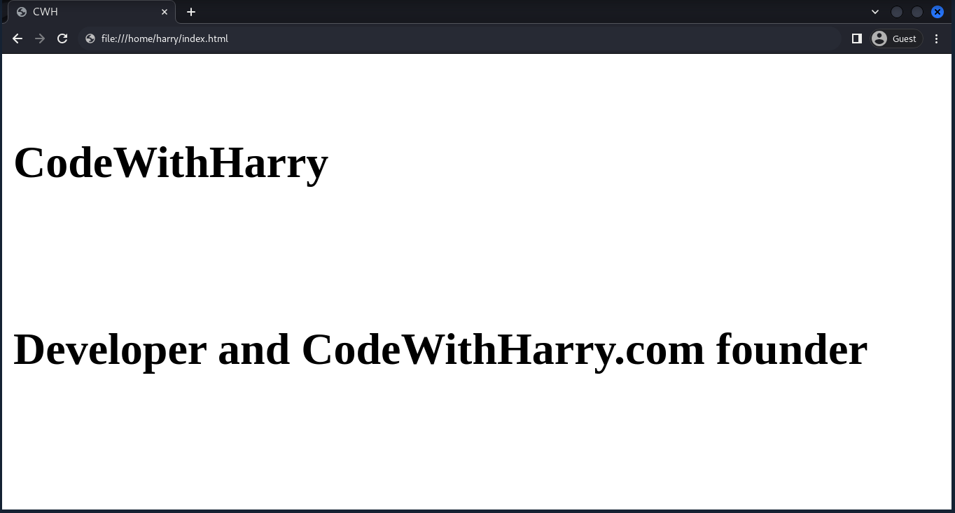
Line Height
The line-height property controls the spacing between two lines of text.
Example:
<html lang="en">
<head>
<style>
h1 {
line-height: 3.5;
}
</style>
</head>
<body>
<h1>CodeWithHarry</h1>
<h1>Developer and CodeWithHarry.com founder</h1>
</body>
</html>The value of 3.5 means that the space between lines will be 3.5 times the height of the font size.
Text Shadow
The text-shadow property adds a shadow to the text.
Syntax:
selector {
text-shadow: horizontal offset, vertical offset, blur radius, color;
}Example:
<html lang="en">
<head>
<style>
h1 {
text-shadow: 2px 3px 4px red;
}
</style>
</head>
<body>
<h1>CodeWithHarry</h1>
</body>
</html>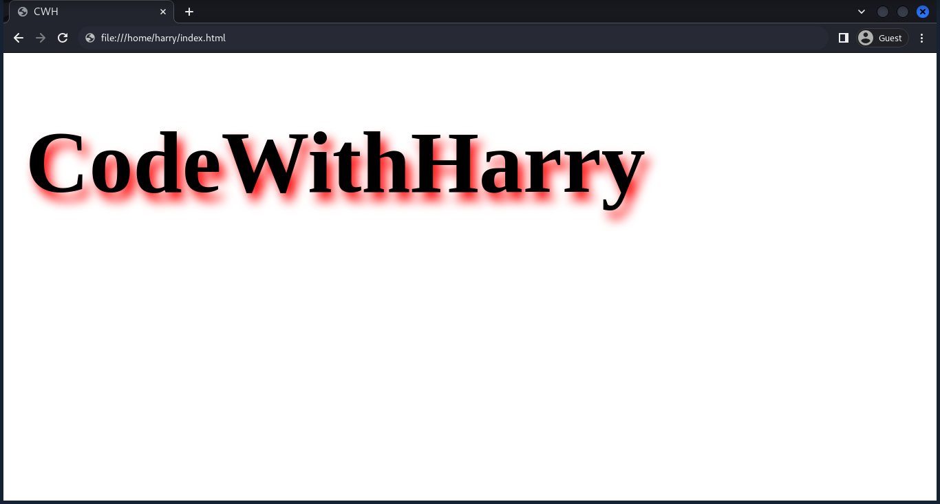
Text Overflow
The text-overflow property handles text that overflows its container. There are two values we can use with text-overflow:
- ellipsis: truncates overflowing text with an ellipsis.
- clip: clips the text without any visual indication.